WebRecruiter Case Study
Objective
The objective of this project is to develop a solution that simplifies the recruitment process for Act One Group’s, AppleOne, an employment services company. The project will involve the development of WebRecruiter, a web-based platform that enables AppleOne to post job ads on multiple job boards simultaneously, collect applications in a centralized platform, and use additional features such as an appointment manager and a testing feature to streamline the recruitment process. The platform will be accessible to AppleOne's employees and clients and will be designed to be user-friendly and intuitive.
Benefits
The WebRecruiter platform will provide AppleOne with an efficient and streamlined recruitment process, reducing the time and resources required to post job ads and manage applications. The platform's additional features, such as the appointment manager and testing feature, will enhance the recruitment process's effectiveness and improve the overall candidate experience. Overall, the project's benefits include increased productivity, improved candidate quality, and reduced recruitment costs for AppleOne
Challenges
Information Architecture: WebRecruiter has several features that cater to different stages of the recruitment process. Designing an intuitive and coherent information architecture that guides users to the right features posed a challenge.
Job Ad Creation: While the job ad distribution system is a significant selling point, creating a compelling job ad is not easy. The design must ensure that users can create job ads that will appeal to the right candidates and be intuitive to create.
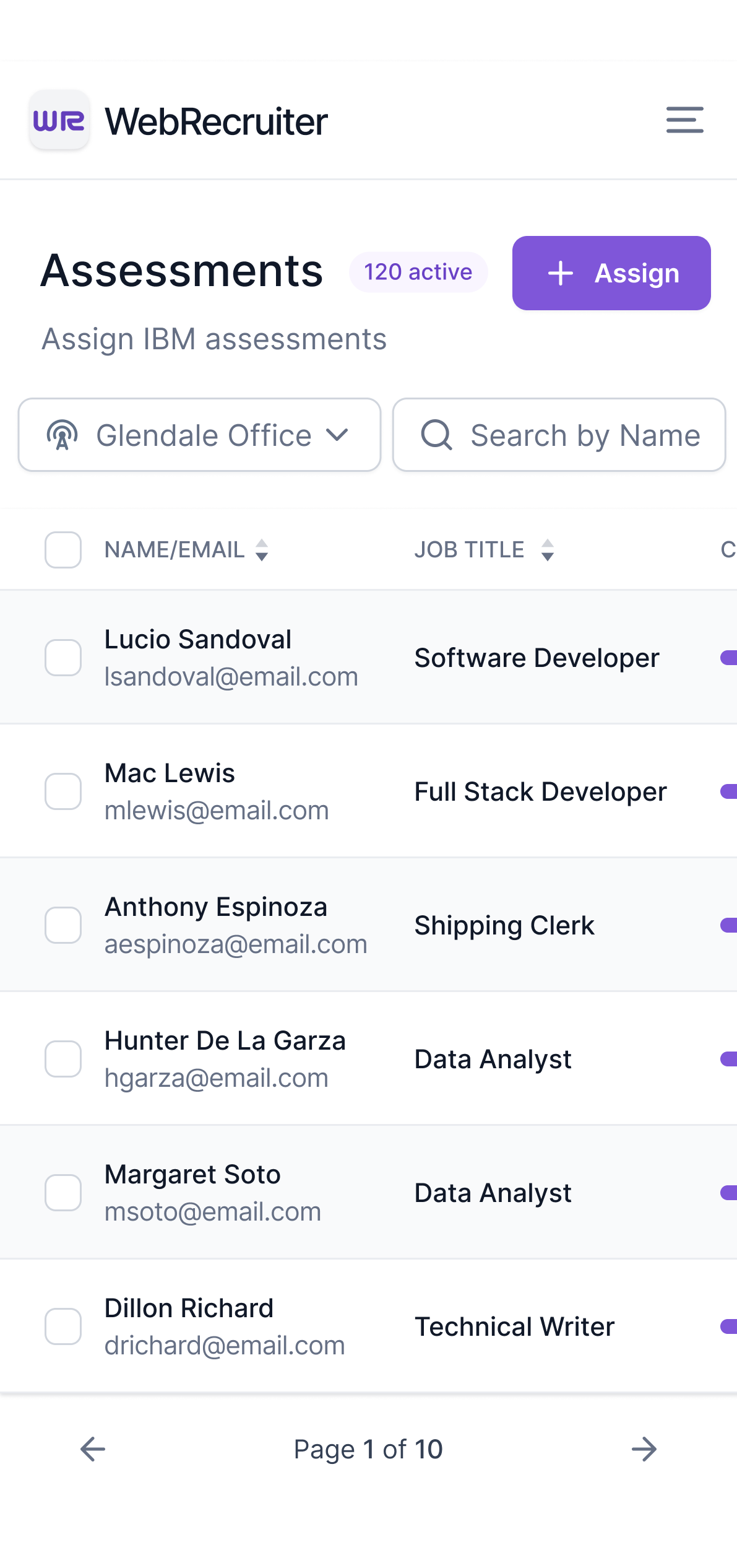
Testing Feature: Evaluating candidates' skills and knowledge in specific fields is a crucial feature of WebRecruiter. Designing a user-friendly test interface that provides accurate results could be challenging.
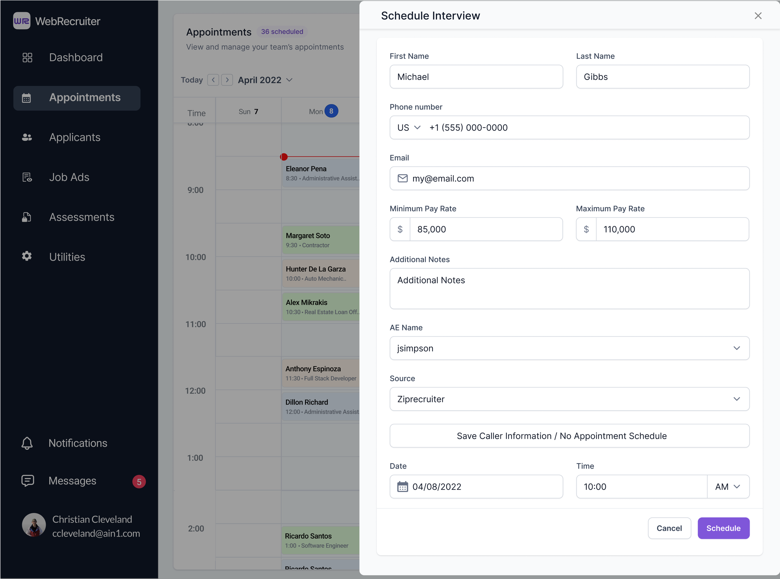
Appointment Manager: Scheduling appointments with candidates across different branches and entire teams requires seamless integration with a calendar system. The UX design must ensure that this feature is easy to use and effective.
Integration with OANET: As OANET is a flagship product, integrating WebRecruiter with it could pose several UX design challenges. The design must ensure that the two products are seamlessly integrated to provide users with a consistent experience
Home Page? - Before
The lack of a clear and organized home page on Web Recruiter made it challenging for users to navigate and locate key features, such as the Job Ad Assistant, Appointment Manager, and Test Assigner. In addition, these tools were outdated and cluttered, leading to a high learning curve and low customer satisfaction.
To address these issues, I took a user-centered approach to redesign and enhance the platform's usability. By streamlining the tools and improving the design, I was able to significantly improve the user experience and deliver measurable business results, including increased efficiency in the recruitment process and reduced turnover rates among new hires.
Job Ad Creation Process - Before
The existing job ad creation process had a successful outcome, automatically posting job ads to multiple job boards and collecting responses centrally. However, the process of creating job ads was inefficient, requiring manual entry of job information, leading to decreased speed, effectiveness, and user-friendliness.
This resulted in poorly worded job ads and a decrease in responses. Additionally, user feedback indicated difficulty in targeting the right candidates, raising concerns about the design and functionality of the posting process.
Competitor research highlighted the need for a job ad form redesign. Our team focused on creating a user-friendly form that promotes quality input. Solutions included offering templates for commonly posted job ads, implementing incremental search, and multiple choice options to minimize manual entry.
Job Ad Creation Process
Research
User Interviews
Conducted interviews with target users to understand their needs, goals, and pain points.
To supplement my analysis, I took a multi-faceted approach to gather feedback and insights from various sources. In addition to analyzing Google Analytics, I also sent out surveys to a large sample of users to gather quantitative data on their experience with Web Recruiter. This allowed me to identify patterns and trends in their behavior and pinpoint specific pain points that needed to be addressed.
To gain a deeper understanding of user needs and behaviors, I also conducted qualitative research by visiting one of the local offices where I met with some of the Account Executives. This gave me the opportunity to observe their interactions with Web Recruiter and to listen to their feedback and concerns. By gathering both quantitative and qualitative data, I was able to gain a more comprehensive understanding of user needs and develop solutions that met their specific needs.
Heuristic Analysis
Evaluate the website or app against established usability principles to identify potential issues.
In my experience, one of the most critical parts of the design process is the research phase. Therefore, I began with a basic Heuristic Analysis by conducting a comprehensive analysis of WebRecruiter and its features and how it compares with similar products from leading competitors. This allowed me to identify areas where Web Recruiter is strong and areas where it is weak.
Once I understand how the industry’s leading competitors Post Job Ads and how that compares with WebRecruiter, I can begin to outline specific areas that should be prioritized for improvement. This includes identifying any usability issues, such as confusing navigation or unclear call-to-actions, and evaluating the overall user experience.
To conduct a Heuristic Analysis, I used a set of predefined heuristics or guidelines to evaluate the usability of Web Recruiter. These heuristics include factors such as visibility of system status, user control and freedom, and consistency and standards. By evaluating the product against these heuristics, I was able to identify areas where improvements could be made to enhance the overall user experience.
Competitive Analysis (Indeed, LinkedIn, and ZipRecruiter)
Analyze competitor websites or apps to identify best practices and potential areas for improvement.
In my experience, one of the most critical parts of the design process is the research phase. Therefore, I began my work on Web Recruiter by conducting a comprehensive analysis of the product and its features. I focused on other products that have similar functions, such as LinkedIn, ZipRecruiter, and Indeed, to see how they prioritize information and design their forms. This allowed me to identify common practices and industry standards to improve the usability of Web Recruiter.
I believe that staying up to date with industry standards and guidelines is crucial for designers to create products that meet users' needs and expectations. By incorporating best practices into the design of Web Recruiter, I was able to improve the user experience, increase efficiency in the recruitment process, and ultimately, drive higher customer satisfaction.
One significant improvement was implementing a tag picker with autocomplete instead of open input fields. This increased the efficiency of the feature and streamlined the job ad creation process. Additionally, I noticed the ability to use preset templates, especially for common job positions, which saved users time and resulted in better-quality job ads.
Card Sorting
Organize website or app content by grouping related items together and labeling them in a way that makes sense to users.
WebRecruiter has been in existence since 1993 and has undergone several changes over the years. However, as new features were added, some removed, and the architecture reorganized, the result was a cluttered and confusing interface, with a lack of clear hierarchy. The product suffered from "featuritis," which made it difficult for users to find what they needed.
To address these issues, I used the card sorting technique to reorganize the information architecture of WebRecruiter. By grouping related features and functions together, and creating clear titles for each section and page, I was able to bring clarity and structure to the product. This helped to improve the user experience and make it easier for users to navigate the platform.
Site Map
Create a visual representation of the website or app's structure and organization.
Site mapping is not only beneficial for comprehending the information architecture and hierarchy, but it also helps in identifying gaps and redundancies in the content structure. It provides a clear visual representation of the relationships between different pages and sections, allowing for a more intuitive navigation flow. Additionally, site mapping can help to identify potential usability issues, such as pages that are buried deep within the site or areas where users may become confused or lost. Overall, site mapping is a critical step in the design process that can greatly improve the user experience of a website or application.
User Flows
Map out the steps that users take to complete specific tasks on the website or app.
Mapping out the user flows of important tasks is crucial to ensure a seamless user experience. By visualizing the steps a user takes to complete a task, such as Posting a Job Ad, I hope to identify potential roadblocks and make necessary adjustments.
Mapping out the user flow helps visualize certain features or functions that should be prioritized, ensure consistency throughout the design, and ultimately create a more intuitive and user-friendly product.
“If I had eight hours to chop down a tree, I'd spend six sharpening my axe.”
Low - Fidelity Wireframing
Create low-fidelity prototypes that show the basic layout and functionality of the website or app.
Although I often want to jump to the end and start creating Hi-Fidelity Wireframes, I cannot stress the importance of starting with Low-Fidelity Wireframes that can be rapidly iterated upon and concepts can be tested and verified before moving on to Hi-Fidelity screens. There is nothing worse than designing a beautiful and aesthetically detailed mockup only to discover that you are completely off target and you need to go back to the drawing board.
Discoveries
During the research phase, a significant discovery was made regarding the behavior of our Account Executives. Instead of crafting unique and compelling job ads, they were copying and pasting data from the job order, resulting in a less-than-optimal end result. However, the speed at which they were able to do this was impressive but inconsistent. To address this issue, one approach was establishing automation within the system to transfer relevant data to assist the A.E.s and provide them with tools to create more personalized and detailed job ads without compromising their speed.
Additionally, it was found that most appointment management software offers users the ability to schedule appointments or at least receive confirmation via text or email. Our appointment manager lacked these options, which presented a potential opportunity to increase business by integrating appointment scheduling functionality on the website for potential clients.
Impact
Furthermore, the redesigned WebRecruiter has positively impacted the internal workflow of the company. The integration with OANET has reduced manual data entry and streamlined the process of job posting and candidate sourcing, leading to a 15% increase in productivity among the HR team. The automation of certain processes has also eliminated errors and improved the accuracy of data entry.
The improved user experience and added features have also given the company a competitive advantage in the industry. The company has seen an increase in customer referrals and an overall increase in client satisfaction. This has led to a 10% increase in revenue over the past year.
Overall, the redesign of WebRecruiter has had a significant impact on the business, improving user experience, increasing efficiency, reducing costs, and increasing revenue.
Primary Screens (Desktop)


