Action Portal Case Study
AppleOne is a huge company with government and private contracts. Every employee uses the same time management system called Action Portal. This product, was in great need of a redesign because over the years, instead of setting up a hierarchy to the product, they just kept adding to it to support all the needs that came up with every new contract the company received. This final outcome was a product that had MAJOR “featuritis”.

When clocking in, user had to first select which employee category they fall under.
The Brief
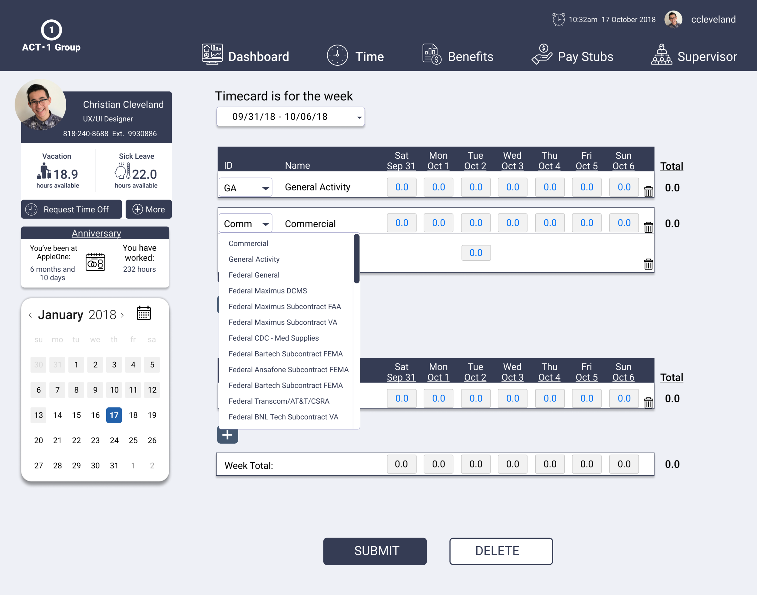
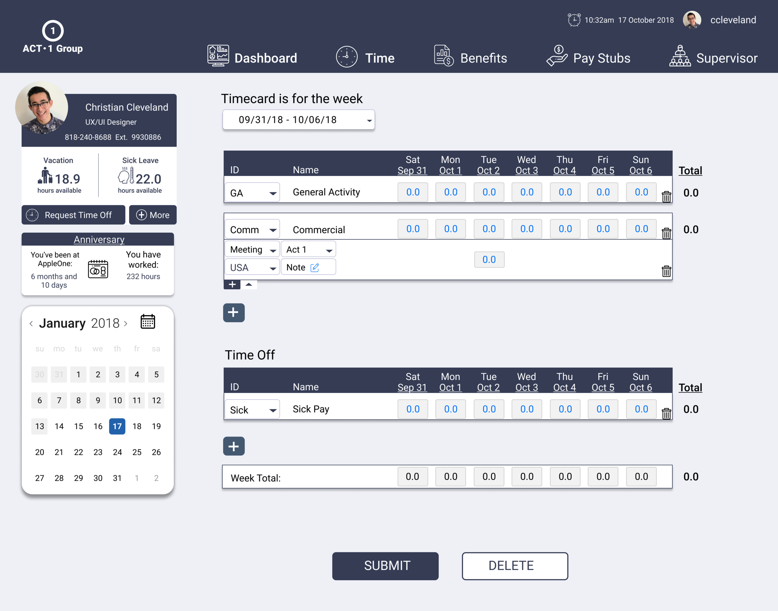
Redesign Action Portal to improve the user experience while accommodating for the many different use cases for time tracking between Coca-Cola employees, amazon employees, truck drivers, and government employees, just to name a few. Another one of the main components was the supervisor perspective which included verifying time cards and assigning delegates. This included desktop and mobile versions.
Research, Research and more Research
At first glance, the product has some clear issues. And as I dived deeper into research the problems stayed true. The Landing Page was too cluttered and there was no hierarchy of navigation at all. Also the actual act of entering one’s times was cumbersome and time consuming. There were tools scattered that were only relevant to about 2% of the users. There were many services that were not even offered or represented. The first step was to establish a form of hierarchy. For that, it was time to do some information architecture aka site maps, card sorting and userflows!


User Interviews
It was clear that logging and submitting hours was the primary reason our users interacted with A.P. yet there were some features that were never used. Most shocking was nobody viewed their vacation and sick leave balance because they did not even know it existed! Instead, our users just called Human Resources to find out their sick leave accrual.
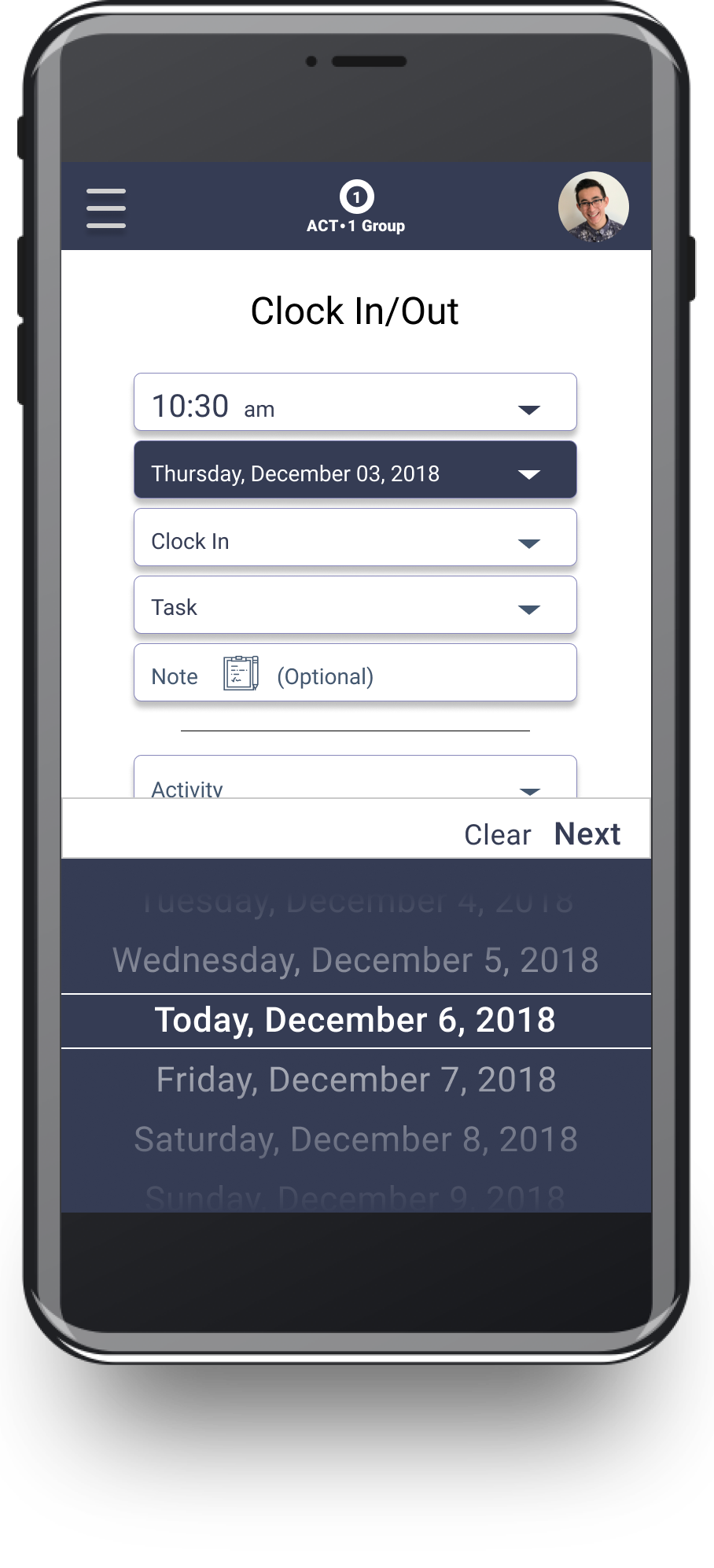
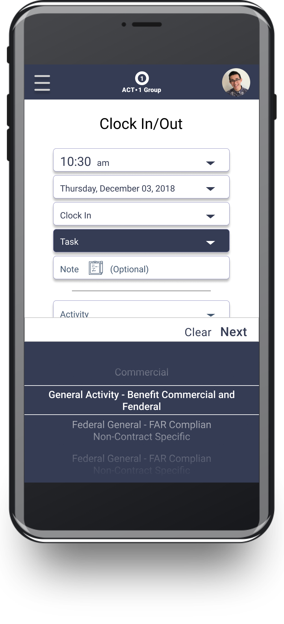
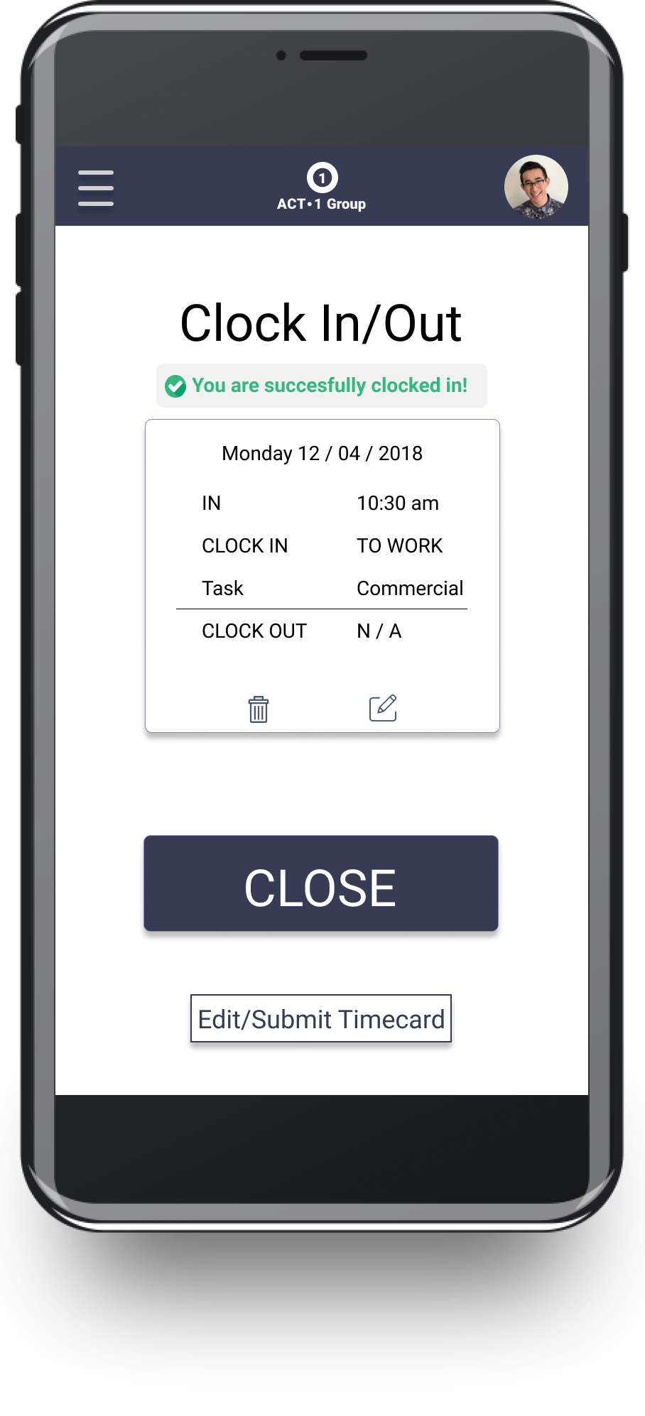
Mobile First!
Here is the mobile redesign of clocking In/out for Hourly Employees. These wireframes were a product of countless sketches, sprints and iterations. My PM (product manager) and I did a ton of brainstorming together and good ol’ fashion white board/expo marker sketches. The best! The final iteration below was tested and met all of the business rules while solving the user’s pain points.


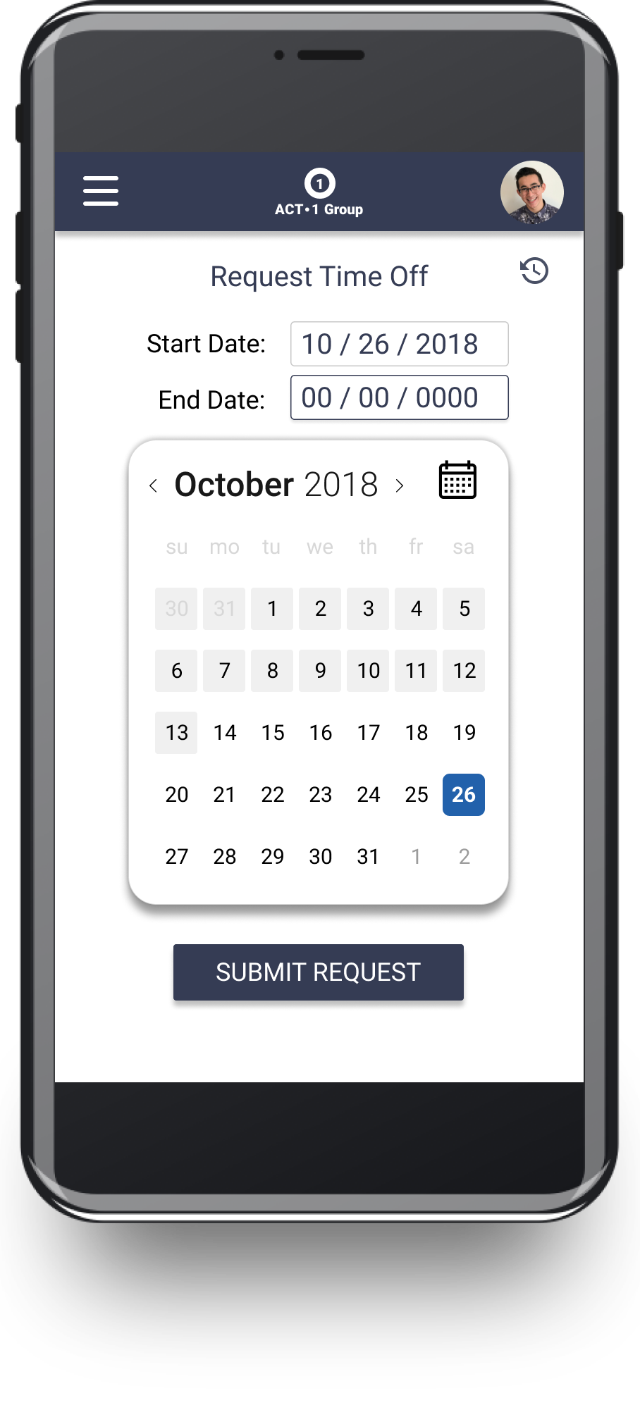
The workflow for Requesting Time Off
Interaction: The user can either click on a start date in the calendar and the selected date will be highlighted allowing the user to click on an end date which will show the dates highlighted. The user is can also input the dates manually as seen in the 4th slide.